Ordway
Evolving a Trusted SaaS Brand Through Strategy and Design
The Client
Ordway Labs is a leading provider of subscription billing and revenue automation software.
Its all-in-one platform combines subscription invoicing, SaaS accounting, recurring billing, and metered billing tools designed to automate complex pricing models, streamline revenue recognition, and accelerate financial close for growing SaaS companies.
Pugh & Tiller has been a trusted partner of Ordway since 2017, supporting design, brand, and marketing initiatives as the company has evolved into one of the most trusted names in subscription billing software.

The Challenge
As Ordway’s platform and product suite expanded, the company needed to modernize its visual brand and reimagine how its solutions were organized and presented online.
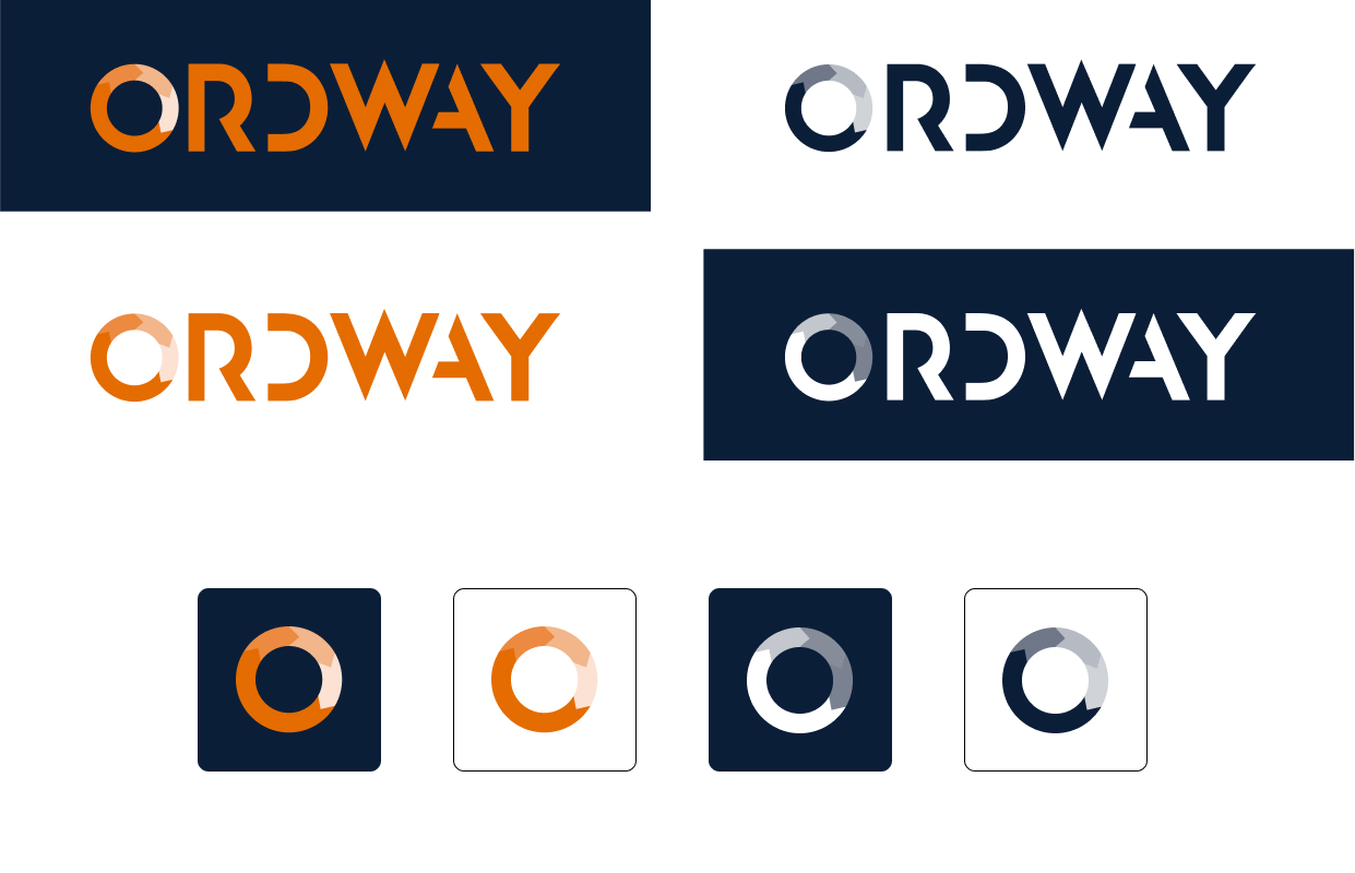
The objective was not a complete rebrand, but a thoughtful evolution—building upon the existing logo, color palette, and typography to create a more cohesive, scalable, and contemporary system.
In addition, Ordway’s marketing and product teams were juggling multiple projects and vendors. Pugh & Tiller’s role required collaborating efficiently with an outside near-shore development partner, responding to a wide range of design and web needs, and ensuring every touchpoint remained consistent with Ordway’s refined brand identity.
The Solution
To address these challenges, Pugh & Tiller focused on evolving Ordway’s brand and digital presence in a way that balanced modernization with continuity. Our work spanned visual identity, website design, and marketing collateral—each reinforcing the brand’s credibility and clarity while supporting ongoing growth and collaboration with their external development team.
Expanding the Visual Brand
• •
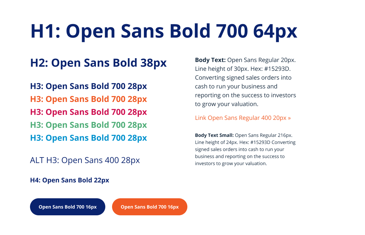
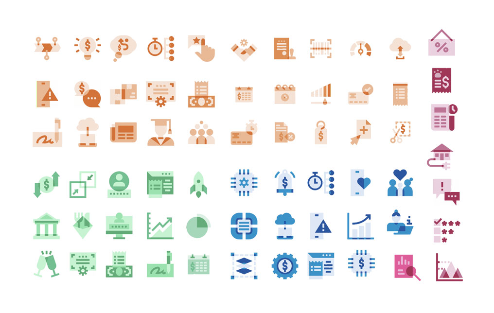
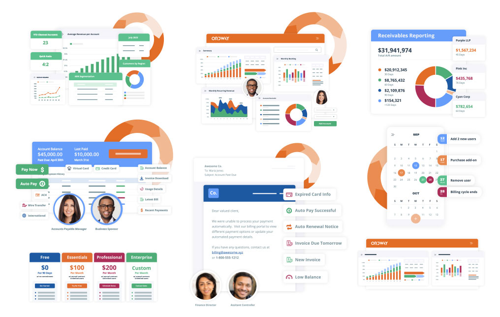
Pugh & Tiller helped evolve Ordway’s brand system to create a more flexible, modern visual identity. This work included expanding product-based color palettes, refining typography and iconography, designing new backgrounds, textures, and graphical elements, and developing social media tiles along with a unified style guide.
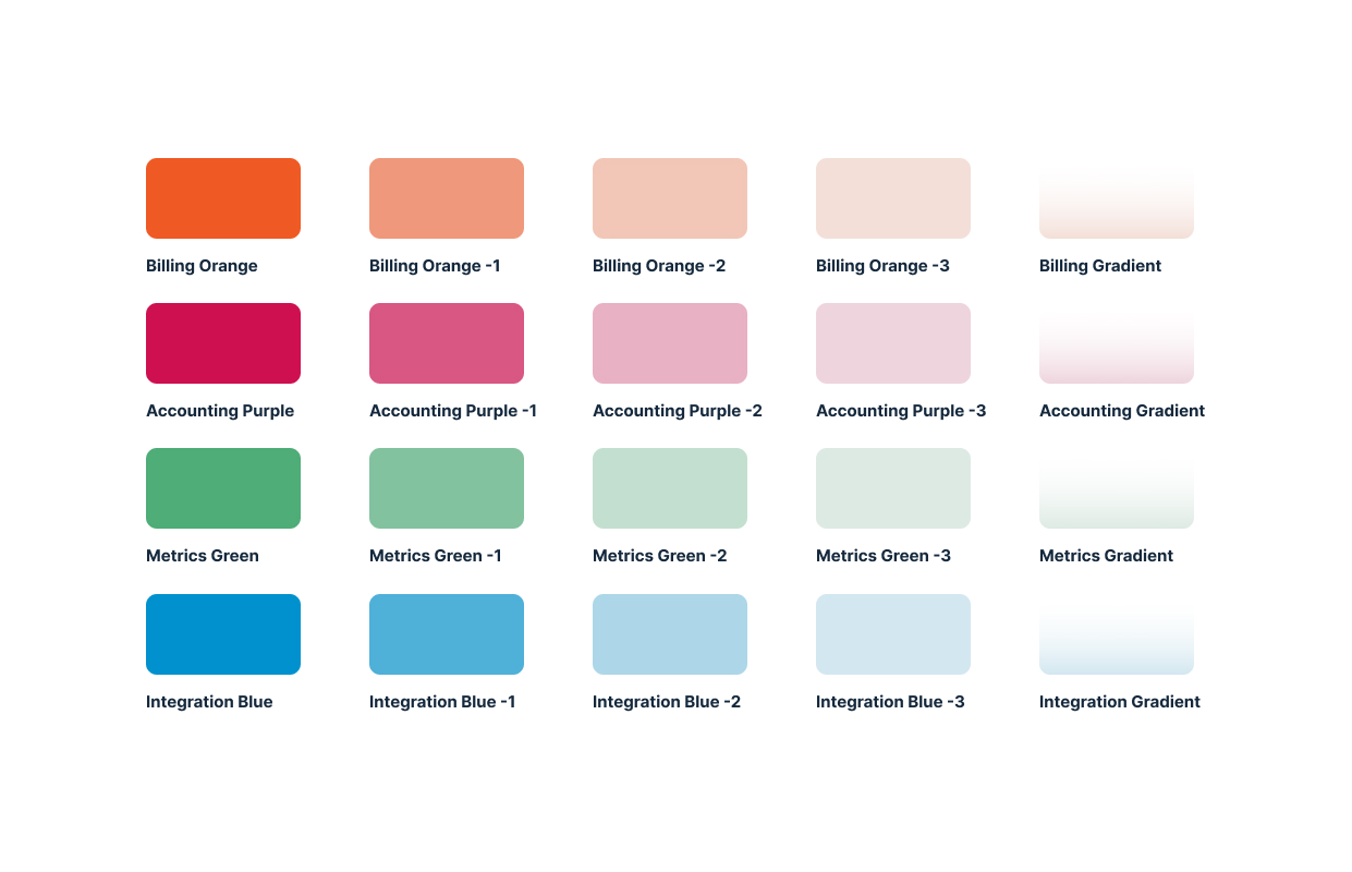
As part of the update, we refreshed Ordway’s two primary brand colors—maintaining their familiarity while increasing brightness and saturation to feel more modern and energetic across digital platforms. We also introduced four supporting product palettes, each with its own coordinated tints and gradients, to bring depth and distinction to different solution areas. Subtle geometric elements—circles, arrows, and dot patterns—were added to represent connection and forward movement, giving layouts a sense of rhythm and cohesion.
Together, these refinements modernized the brand’s visual energy while keeping it unmistakably Ordway.

Website Design and Development Support
• • •
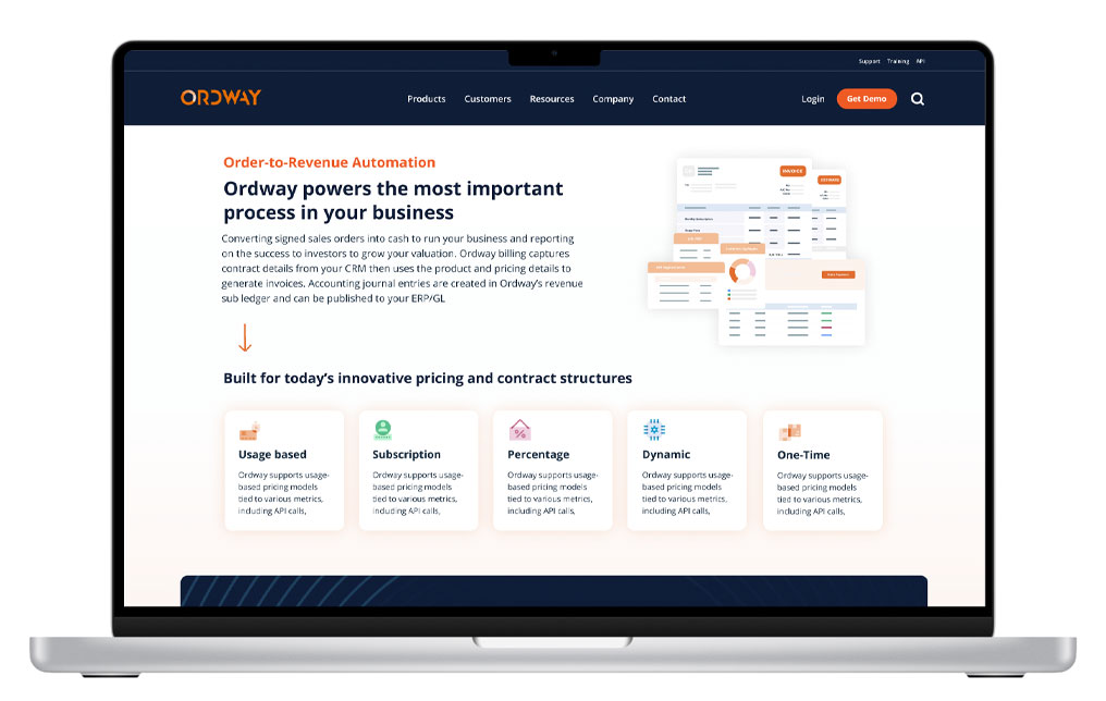
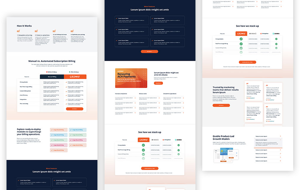
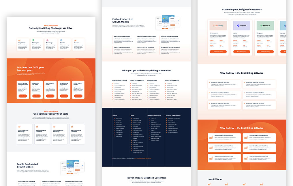
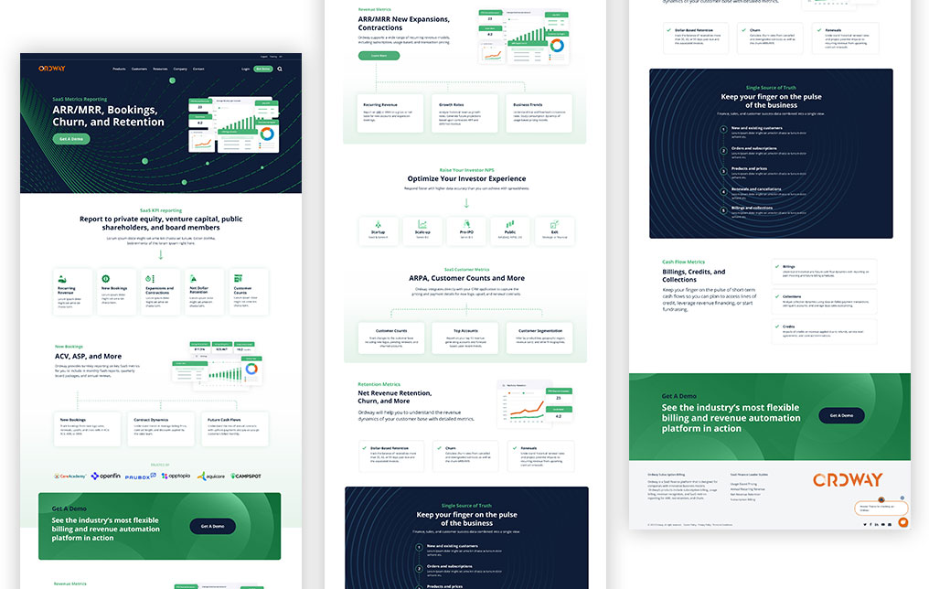
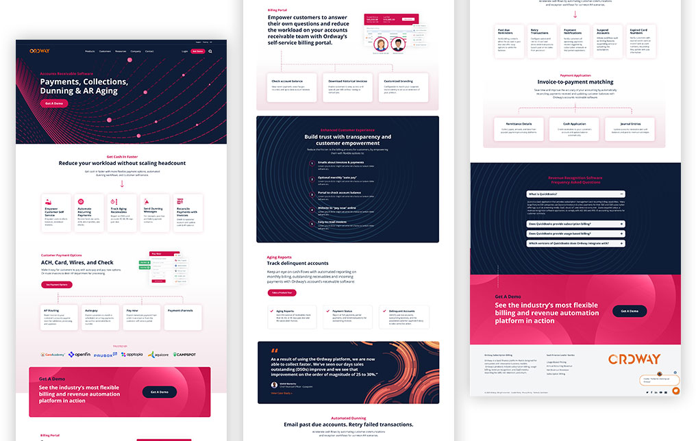
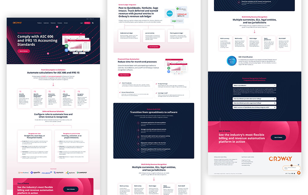
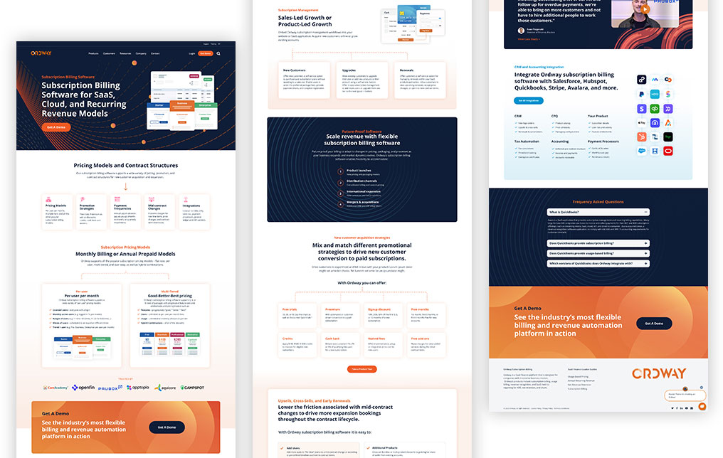
Working within Ordway’s existing digital framework, Pugh & Tiller designed and developed new pages and templates, including eight new product pages, competitor comparison page templates for improved clarity and conversion, and modular content blocks that enable faster page builds and smoother collaboration with their near-shore vendor.
The new pages leveraged expanded brand elements and laid the groundwork for AI search optimization, introducing structured content, FAQs, and schema markup as part of a continuing effort to enhance discoverability and topical authority.
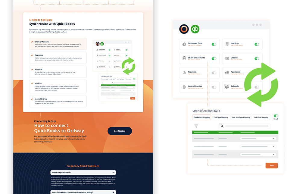
To enhance engagement, Pugh & Tiller also designed a series of lightweight animated SVGs and interactive graphics. These animations added visual interest to key pages without sacrificing load time or accessibility.

Marketing Materials and Events
• •
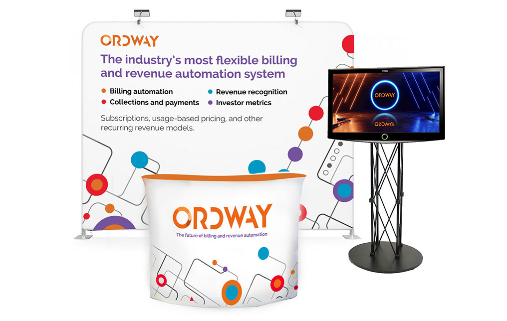
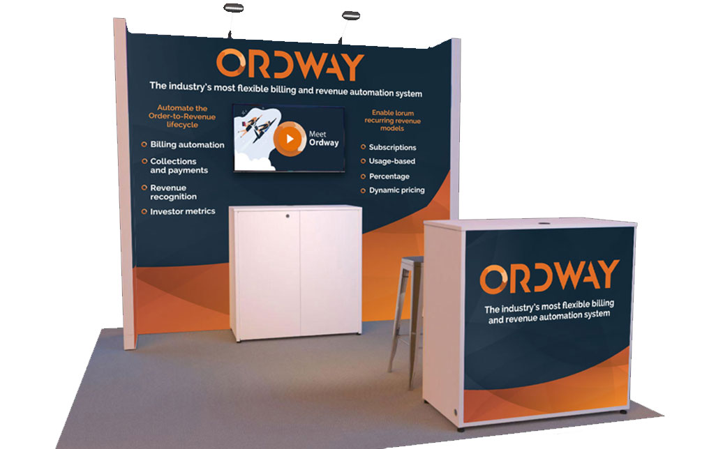
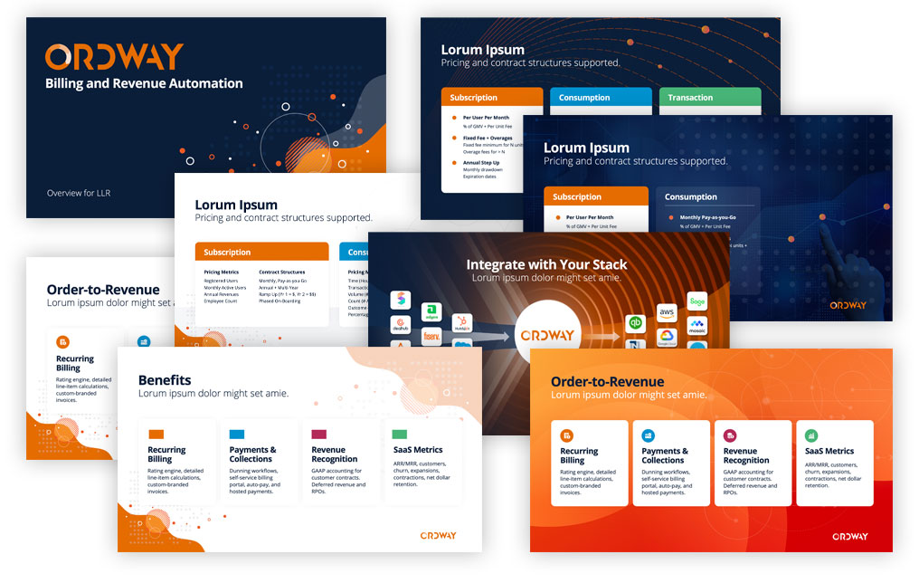
We developed a full suite of supporting materials to reinforce Ordway’s brand at every touchpoint. This included product brochures and PowerPoint decks, tradeshow booth designs for major industry events such as the AFP Annual Conference, Sage Transform, SaaStr Annual, SaaS North, RD2, and others, as well as video intros and lower-third templates for easy-to-produce explainer videos. We also created billboard creative for display on U.S. Route 101 in Silicon Valley in October 2025.
The Results
Ordway continues to rely on Pugh & Tiller for ongoing support across graphic design, branding, and web design/development, ensuring continuity and rapid response to evolving needs.
Ordway’s refreshed brand now reflects the sophistication and agility of its software—modern, professional, and scalable without losing the familiarity of its core identity. The new product suite pages improved visual clarity, comprehension, and engagement, aligning with AI-driven SEO best practices such as structured content, clear topical hierarchy, and ongoing optimization.
Pugh & Tiller’s collaboration with Ordway’s near-shore vendor has streamlined workflows and ensured consistent implementation across platforms.
”Pugh & Tiller has helped us modernize our brand without tearing everything down. They took what already existed—our colors, fonts, and overall visual system—and elevated it in a way that feels fresh and cohesive. At the same time, they built a scalable website model that empowers our in-house team to manage and grow content easily. It’s been a true partnership that’s made a lasting impact.
S. KeiferCMO, Ordway Labs
